Anatomy of a Constraint
해당 글은 아래 글을 번역한 것이다.
The layout of your view hierarchy is defined as a series of linear equations. Each constraint represents a single equation. Your goal is to declare a series of equations that has one and only one possible solution. A sample equation is shown below.
뷰 계층 구조의 레이아웃은 일련의 선형 방정식으로 정의된다. 각 제약조건은 단일 방정식을 나타낸다. 당신의 목표는 단 하나의 해를 갖는 일련의 방정식을 선언하는 것이다. 아래의 샘플 방정식을 보자.
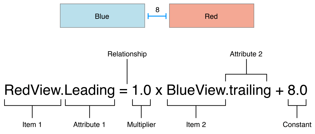
This constraint states that the red view’s leading edge must be 8.0 points after the blue view’s trailing edge. Its equation has a number of parts:
이 제약 조건은 빨간색 뷰의 리딩 가장자리가 파란색 뷰의 뒤쪽 트레일링 + 8.0 포인트 뒤에 있어야 함을 나타낸다. 방정식은 몇 가지 부분으로 구성된다.
- Item 1. The first item in the equation—in this case, the red view. The item must be either a view or a layout guide.
- Attribute 1. The attribute to be constrained on the first item—in this case, the red view’s leading edge.
- Relationship. The relationship between the left and right sides. The relationship can have one of three values: equal, greater than or equal, or less than or equal. In this case, the left and right side are equal.
- Multiplier. The value of attribute 2 is multiplied by this floating point number. In this case, the multiplier is 1.0.
- Item 2. The second item in the equation—in this case, the blue view. Unlike the first item, this can be left blank.
- Attribute 2. The attribute to be constrained on the second item—in this case, the blue view’s trailing edge. If the second item is left blank, this must be Not an Attribute.
- Constant. A constant, floating-point offset—in this case, 8.0. This value is added to the value of attribute 2.
- Item 1. 방정식의 첫번째 항목, 뷰 혹은 레이아웃 가이드여야 한다. - 빨간색 뷰
- Attribute 1. 첫번째 항목에 제한되는 속성. - 빨간색 뷰의 선행 가장자리
- Relationship. 왼쪽과 오른쪽의 관계. 관계는 같음, 크거나 같음, 작거나 같음의 세 가지 값 중 하나를 가질 수 있다. - 왼쪽과 오른쪽이 동일
- Multiplier. 속성 2의 값에 이 플로팅 숫자를 곱한다. - 1.0
- Item 2. 방정식의 두번째 항목. 첫번째 항목과 달리, 비워둘 수 있다. - 파란색 뷰
- Attribute 2. 두번째 항목에 제한되는 속성. 두번째 항목이 비어져 있을 경우
Not an Attribute이어야 함. - 파란색 뷰의 후행 가장자리 - Constant. 상수 플로팅 오프셋. 속성 2의 값에 추가된다. - 8.0
Most constraints define a relationship between two items in our user interface. These items can represent either views or layout guides. Constraints can also define the relationship between two different attributes of a single item, for example, setting an aspect ratio between an item’s height and width. You can also assign constant values to an item’s height or width. When working with constant values, the second item is left blank, the second attribute is set to Not An Attribute, and the multiplier is set to 0.0.
대부분의 제약조건은 사용자 인터페이스에서 두 항목 간의 관계를 정의한다. 이러한 항목들은 뷰 또는 레이아웃
가이드를 나타낼 수 있다. 제약조건은 단일 항목의 서로 다른 두 속성 간의 관계를 정의할 수도 있다. 예를 들어,
항목의 높이와 너비 사이의 가로 세로 비율 설정하기. 항목의 높이나 너비에 상수 값을 할당할 수도 있다. 상수
값으로 작업할 때 두 번째 항목은 비워 두고 두 번째 속성은 Not An Attribute 으로 설정되며 승수는 0.0
으로 설정된다.
Auto Layout Attributes
In Auto Layout, the attributes define a feature that can be constrained. In general, this includes the four edges (leading, trailing, top, and bottom), as well as the height, width, and vertical and horizontal centers. Text items also have one or more baseline attributes.
오토 레이아웃에서 속성은 제한할 수 있는 기능을 정의한다. 일반적으로 여기에는 4개의 가장자리(선행, 후행, 위, 아래)와 높이, 너비, 세로 및 가로 중앙이 포함된다. 텍스트 항목에는 하나 이상의 베이스라인 속성도 있다.

For the complete list of attributes, see the NSLayoutAttribute enum.
전체 속성 목록은 NSLayoutAttribute열거형을 참조하자.
Although both OS X and iOS use the NSLayoutAttribute enum, they define slightly different sets of values. To see the full list of attributes, be sure you are looking at the correct platform’s documentation.
OS X와 iOS 모두 NSLayoutAttribute열거형을 사용하지만 약간 다른 값 집합을 정의한다. 전체 속성 목록을 보려면 올바른 플랫폼의 설명서를 확인하자.
Sample Equations
샘플 방정식
The wide range of parameters and attributes available to these equations lets you create many different types of constraints. You can define the space between views, align the edge of views, define the relative size of two views, or even define a view’s aspect ratio. However, not all attributes are compatible.
이러한 방정식에 사용할 수 있는 광범위한 매개변수와 속성을 사용하면 다양한 유형의 제약 조건을 만들 수 있다. 뷰 사이의 공간을 정의하고, 뷰 가장자리를 정렬하고, 두 뷰의 상대적 크기를 정의하거나, 뷰의 종횡비를 정의할 수도 있다. 그러나 모든 속성이 호환되는 것은 아니다.
There are two basic types of attributes. Size attributes (for example, Height and Width) and location attributes (for example, Leading, Left, and Top). Size attributes are used to specify how large an item is, without any indication of its location. Location attributes are used to specify the location of an item relative to something else. However, they carry no indication of the item’s size.
속성에는 두 가지 기본 유형이 있다. 크기 속성(예: 높이 및 너비) 및 위치 속성(예: 선행, 왼쪽, 위쪽) 크기 속성은 위치를 표시하지 않고 항목의 크기를 지정하는 데 사용된다. 위치 속성은 다른 항목과 관련된 항목의 위치를 지정하는 데 사용되지만, 항목의 크기에 대한 정보는 없습니다.
With these differences in mind, the following rules apply:
이러한 차이점을 염두에 두고 다음 규칙이 적용된다.
- You cannot constrain a size attribute to a location attribute.
- You cannot assign constant values to location attributes.
- You cannot use a nonidentity multiplier (a value other than 1.0) with location attributes.
- For location attributes, you cannot constrain vertical attributes to horizontal attributes.
- For location attributes, you cannot constrain Leading or Trailing attributes to Left or Right attributes.
- 크기 속성을 위치 속성으로 제한할 수 없다.
- 위치 속성에는 상수 값을 할당할 수 없다.
- 위치 속성에는 비식별 승수(1.0 이외의 값)를 사용할 수 없다.
- 위치 속성의 경우 수직 속성을 수평 속성으로 제한할 수 없다.
- 위치 속성의 경우 선행 또는 후행 속성을 왼쪽 또는 오른쪽 속성으로 제한할 수 없습니다.
For example, setting an item’s Top to the constant value 20.0 has no meaning without additional context. You must always define an item’s location attributes in relation to other items, for example, 20.0 points below the superview’s Top. However, setting an item’s Height to 20.0 is perfectly valid. For more information, see Interpreting Values.
예를 들어 항목의 Top을 상수 값 20.0으로 설정하는 것은 추가 컨텍스트 없이는 의미가 없다. 항상 다른 항목과 관련하여 항목의 위치 속성을 정의해야 한다. 예를 들어, 슈퍼뷰 상단에서 20.0포인트 아래 와 같은, 그렇지만 항목의 높이를 20.0으로 설정하는 것은 완벽하게 유효하다. 자세한 내용은 값 해석을 참조하자.
// Setting a constant height
View.height = 0.0 * NotAnAttribute + 40.0

// Setting a fixed distance between two buttons
Button_2.leading = 1.0 * Button_1.trailing + 8.0

// Aligning the leading edge of two buttons
Button_1.leading = 1.0 * Button_2.leading + 0.0

// Give two buttons the same width
Button_1.width = 1.0 * Button_2.width + 0.0

// Center a view in its superview
View.centerX = 1.0 * Superview.centerX + 0.0
View.centerY = 1.0 * Superview.centerY + 0.0

// Give a view a constant aspect ratio
View.height = 2.0 * View.width + 0.0
Equality, Not Assignment
할당이 아닌 평등
It’s important to note that the equations shown in Note represent equality, not assignment.
표시되는 방정식은 할당이 아닌 동일성을 나타내는 것에 유의하자.
When Auto Layout solves these equations, it does not just assign the value of the right side to the left. Instead, it calculates the value for both attribute 1 and attribute 2 that makes the relationship true. This means we can often freely reorder the items in the equation. For example, the equations in Listing 3-2 are identical to their counterparts in Note.
오토 레이아웃은 이러한 방정식을 풀 때 단순히 오른쪽의 값을 왼쪽에 할당하지 않는다. 대신 관계를 참으로 만드는 속성 1과 속성 2의 값을 모두 계산한다. 이는 종종 방정식의 항목을 자유롭게 재정렬할 수 있음을 의한다. 예를 들어 Listing 3-2와 Listing 3-1의 방정식과 동일하다.
// Setting a fixed distance between two buttons
Button_1.trailing = 1.0 * Button_2.leading - 8.0

// Aligning the leading edge of two buttons
Button_2.leading = 1.0 * Button_1.leading + 0.0

// Give two buttons the same width
Button_2.width = 1.0 * Button.width + 0.0

// Center a view in its superview
Superview.centerX = 1.0 * View.centerX + 0.0
Superview.centerY = 1.0 * View.centerY + 0.0

// Give a view a constant aspect ratio
View.width = 0.5 * View.height + 0.0
When reordering the items, make sure you invert the multiplier and the constant. For example, a constant of 8.0 becomes -8.0. A multiplier of 2.0 becomes 0.5. Constants of 0.0 and multipliers of 1.0 remain unchanged.
항목을 재정렬할 때 승수와 상수를 반대로 바꿔야 한다. 예를 들어, 상수 8.0는 -8.0가 된다. 2.0의 승수 0.5는가 된다. 0.0의 상수와 1.0승수는 변경되지 않는다.
You will find that Auto Layout frequently provides multiple ways to solve the same problem. Ideally, you should choose the solution that most clearly describes your intent. However, different developers will undoubtedly disagree about which solution is best. Here, being consistent is better than being right. You will experience fewer problems in the long run if you choose an approach and always stick with it. For example, this guide uses the following rules of thumb:
오토 레이아웃은 동일한 문제를 해결하기 위한 다양한 방법을 제공하는 경우가 많다. 이상적으로는 의도를 가장 명확하게 설명하는 솔루션을 선택해야 한다. 그러나 어떤 솔루션이 가장 좋은지에 대해서는 개발자마다 의견이 다를 것이다. 여기서는 일관성을 유지하는 것이 옳은 것보다 낫다. 접근 방식을 선택하고 항상 이를 고수하면 장기적으로 문제가 줄어든다. 예를 들어, 이 가이드에서는 다음과 같은 경험 법칙을 사용한다.
- Whole number multipliers are favored over fractional multipliers.
- Positive constants are favored over negative constants.
- Wherever possible, views should appear in layout order: leading to trailing, top to bottom.
- 정수 승수는 분수 승수보다 선호된다.
- 음수 상수보다 양수 상수가 선호된다.
- 가능하다면 뷰는 레이아웃 순서(선행에서 후행, 위에서 아래)로 나타나야 한다.
3번의 경우, width, height 순서로, 배치한다는 점은 직관적이다. margin과 padding 적용 순서가 css와 달라 햇깔릴 수도 있다.
css는 시계방향으로 적용된다. (위, 오른쪽, 아래, 왼쪽) 이건 css가 덜 직관적인 것 같기도?
Creating Nonambiguous, Satisfiable Layouts
모호하지 않고 만족스러운 레이아웃 만들기
When using Auto Layout, the goal is to provide a series of equations that have one and only one possible solution. Ambiguous constraints have more than one possible solution. Unsatisfiable constraints don’t have valid solutions.
오토 레이아웃을 사용할 때 목표는 단 하나의 가능한 솔루션이 있는 일련의 방정식을 제공하는 것이다. 모호한 제약 조건에는 두 가지 이상의 가능한 솔루션이 있다. 만족할 수 없는 제약조건에는 유효한 솔루션이 없다.
In general, the constraints must define both the size and the position of each view. Assuming the superview’s size is already set (for example, the root view of a scene in iOS), a nonambiguous, satisfiable layout requires two constraints per view per dimension (not counting the superview). However, you have a wide range of options when it comes to choosing which constraints you want to use. For example, the following three layouts all produce nonambiguous, satisfiable layouts (only the horizontal constraints are shown):
일반적으로 제약조건은 각 뷰의 크기와 위치를 모두 정의해야 한다. 슈퍼뷰의 크기가 이미 설정되어 있다고 가정하면(예: iOS 장면의 루트 뷰) 모호하지 않고 만족스러운 레이아웃에는 차원당 뷰당 두 개의 제약 조건이 필요하다(슈퍼뷰는 계산하지 않음). 그러나 사용하려는 제약 조건을 선택할 때 다양한 옵션이 있다. 예를 들어 다음 세 가지 레이아웃은 모두 모호하지 않고 만족스러운 레이아웃을 생성한다(수평 제약 조건만 표시됨).

- The first layout constrains the view’s leading edge relative to its superview’s leading edge. It also gives the view a fixed width. The position of the trailing edge can then be calculated based on the superview’s size and the other constraints.
- The second layout constrains the view’s leading edge relative to its superview’s leading edge. It also constrains the view’s trailing edge relative to the superview’s trailing edge. The view’s width can then be calculated based on the superview’s size and the other constraints.
- The third layout constrains the view’s leading edge relative to its superview’s leading edge. It also center aligns the view and superview. Both the width and trailing edge’s position can then be calculated based on the superview’s size and the other constraints.
- 첫 번째 레이아웃은 상위 뷰의 선행 가장자리를 기준으로 뷰의 선행 가장자리를 제한한다. 또한 뷰에 고정된 너비를 제공한다. 그런 다음 후행 가장자리의 위치는 슈퍼뷰의 크기와 기타 제약 조건을 기반으로 계산될 수 있다.
- 두 번째 레이아웃은 상위 뷰의 선행 가장자리를 기준으로 뷰의 선행 가장자리를 제한한다. 또한 슈퍼뷰의 후행 가장자리를 기준으로 뷰의 후행 가장자리를 제한한다. 그런 다음 슈퍼뷰의 크기와 기타 제약 조건을 기반으로 뷰의 너비를 계산할 수 있다.
- 세 번째 레이아웃은 상위 뷰의 선행 가장자리를 기준으로 뷰의 선행 가장자리를 제한한다. 또한 뷰와 수퍼뷰를 중앙에 정렬한다. 그런 다음 슈퍼뷰의 크기와 기타 제약 조건을 기반으로 너비와 후행 가장자리의 위치를 모두 계산할 수 있다.
Notice that each layout has one view and two horizontal constraints. In each case, the constraints fully define both the width and the horizontal position of the view. That means all of the layouts produce a nonambiguous, satisfiable layout along the horizontal axis. However, these layouts are not equally useful. Consider what happens when the superview’s width changes.
각 레이아웃에는 하나의 뷰와 두 개의 수평 제약 조건이 있다. 각각의 경우 제약 조건은 뷰의 너비와 수평 위치를 모두 정의한다. 이는 모든 레이아웃이 수평 축을 따라 모호하지 않고 만족스러운 레이아웃을 생성한다는 것을 의미한다. 그러나 이러한 레이아웃은 똑같이 유용하지 않다. 슈퍼뷰의 너비가 변경되면 어떤 일이 발생하는지 생각해 보자.
In the first layout, the view’s width does not change. Most of the time, this is not what you want. In fact, as a general rule, you should avoid assigning constant sizes to views. Auto Layout is designed to create layouts that dynamically adapt to their environment. Whenever you give a view a fixed size, you short circuiting that ability.
첫 번째 레이아웃에서는 뷰의 너비가 변경되지 않는다. 대부분의 경우 이는 원하는 것이 아닐 것이다. 실제로 일반적으로 뷰에 일정한 크기를 할당하는 것은 피해야 한다. 오토 레이아웃은 환경에 동적으로 적응하는 레이아웃을 생성하도록 설계되었다. 뷰에 고정된 크기를 제공할 때마다 해당 기능이 제한된다.
It may not be obvious, but the second and third layouts produce identical behaviors: They both maintain a fixed margin between the view and its superview as the superview’s width changes. However, they are not necessarily equal. In general, the second example is easier to understand, but the third example may be more useful, especially when you are center aligning a number of items. As always, choose the best approach for your particular layout.
명확하지 않을 수도 있지만 두 번째와 세 번째 레이아웃은 동일한 동작을 생성한다. 둘 다 슈퍼뷰의 너비가 변경됨에 따라 뷰와 해당 슈퍼뷰 사이에 고정된 여백을 유지합니다. 그러나 반드시 동일하지는 않다. 일반적으로 두 번째 예가 이해하기 쉽지만 특히 여러 항목을 가운데 정렬할 때 세 번째 예가 더 유용할 수 있다. 항상 특정 레이아웃에 가장 적합한 접근 방식을 선택하자.
Now consider something a little more complicated. Imagine you want to display two views, side by side, on an iPhone. You want to make sure that they have a nice margin on all sides and that they always have the same width. They should also correctly resize as the device rotates.
이제 좀 더 복잡한 것을 생각해보자. iPhone에 두 개의 뷰를 나란히 표시하고 싶다고 상상해 보자. 모든 면에 적절한 여백이 있고 항상 동일한 너비를 갖고 있는지 확인하고 싶다. 또한 장치가 회전함에 따라 크기가 올바르게 조정되어야 한다.
The following illustrations show the views, in portrait and landscape orientation:
다음 그림은 세로 및 가로 방향의 뷰를 보여준다.


So what should these constraints look like? The following illustration shows one straightforward solution:
그렇다면 이러한 제약조건은 어떤 모습이어야 할까? 다음 그림은 하나의 간단한 솔루션을 보여준다.

The above solution uses the following constraints:
위의 솔루션은 다음 제약조건을 사용한다.
// Vertical Constraints
Red.top = 1.0 * Superview.top + 20.0
Superview.bottom = 1.0 * Red.bottom + 20.0
Blue.top = 1.0 * Superview.top + 20.0
Superview.bottom = 1.0 * Blue.bottom + 20.0

// Horizontal Constraints
Red.leading = 1.0 * Superview.leading + 20.0
Blue.leading = 1.0 * Red.trailing + 8.0
Superview.trailing = 1.0 * Blue.trailing + 20.0
Red.width = 1.0 * Blue.width + 0.0
싹다 잡은 경우
Following the earlier rule of thumb, this layout has two views, four horizontal constraints, and four vertical constraints. While this isn’t an infallible guide, it is a quick indication that you’re on the right track. More importantly, the constraints uniquely specify both the size and the location of both of the views, producing a nonambiguous, satisfiable layout. Remove any of these constraints, and the layout becomes ambiguous. Add additional constraints, and you risk introducing conflicts.
이전 경험 법칙에 따라 이 레이아웃에는 뷰 2개, 수평 제약 조건 4개, 수직 제약 조건 4개가 있다. 이는 완벽한 가이드는 아니지만 귀하가 올바른 길을 가고 있다는 빠른 표시다. 더 중요한 것은 제약조건이 두 뷰의 크기와 위치를 모두 고유하게 지정하여 모호하지 않고 만족스러운 레이아웃을 생성한다는 것이다. 이러한 제약조건 중 하나를 제거하면 레이아웃이 모호해진다. 제약조건을 추가하면 충돌이 발생할 위험이 있다.
Still, this is not the only possible solution. Here is an equally valid approach:
하지만 이것이 유일한 해결책은 아니다. 다음은 똑같이 유효한 접근 방식이다.

Instead of pinning the top and bottom of the blue box to its superview, you align the top of the blue box with the top of the red box. Similarly, you align the bottom of the blue box with the bottom of the red box. The constraints are shown below.
파란색 뷰의 상단과 하단을 해당 슈퍼뷰에 고정하는 대신 파란색 상자의 상단을 빨간색 상자의 상단과 정렬한다. 마찬가지로 파란색 상자의 아래쪽을 빨간색 상자의 아래쪽에 맞춘다. 제약 조건은 아래와 같다.
// Vertical Constraints
Red.top = 1.0 * Superview.top + 20.0
Superview.bottom = 1.0 * Red.bottom + 20.0
Red.top = 1.0 * Blue.top + 0.0
Red.bottom = 1.0 * Blue.bottom + 0.0

//Horizontal Constraints
Red.leading = 1.0 * Superview.leading + 20.0
Blue.leading = 1.0 * Red.trailing + 8.0
Superview.trailing = 1.0 * Blue.trailing + 20.0
Red.width = 1.0 * Blue.width + 0.0
빨간색 뷰를 기준으로 파란색 뷰를 배치하는 경우
The example still has two views, four horizontal constraints, and four vertical constraints. It still produces a nonambiguous, satisfiable layout.
이 예에는 여전히 2개의 뷰, 4개의 수평 제약 조건, 4개의 수직 제약 조건이 있다. 이는 여전히 모호하지 않고 만족스러운 레이아웃을 생성한다.
These solutions both produce valid layouts. So which is better?
Unfortunately, it is virtually impossible to objectively prove that one approach is strictly superior to the other. Each has its own strengths and weaknesses.
The first solution is more robust when a view is removed. Removing a view from the view hierarchy also removes all the constraints that reference that view. So, if you remove the red view, the blue view is left with three constraints holding it in place. You need to add only a single constraint and you have a valid layout again. In the second solution, removing the red view would leave the blue view with only a single constraint.
On the other hand, in the first solution, If you want the top and bottom of the views to align, you must make sure their top and bottom constraints use the same constant value. If you change one constant, you must remember to change the other as well.
머가 더 낫냐?
위 솔루션 둘다 유효한 레이아웃을 생성한다. 그렇다면 어느 것이 더 나은가?
불행하게도 한 가지 접근 방식이 다른 접근 방식보다 확실히 우수하다는 것을 객관적으로 증명하는 것은 사실상 불가능하다. 각각의 고유한 강점과 약점이 있다.
첫 번째 솔루션은 뷰가 제거될 때 더욱 강력해진다. 뷰 계층 구조에서 뷰를 제거하면 해당 뷰를 참조하는 모든 제약 조건도 제거된다. 따라서 빨간색 뷰를 제거하면 파란색 뷰에는 이를 고정하는 세 가지 제약 조건만 남게된다. 단일 제약 조건만 추가하면, 다시 유효한 레이아웃을 만들 수 있다. 두 번째 솔루션은 빨간색 뷰를 제거하면, 파란색 뷰에는 단일 제약 조건만 남게된다.
반면, 첫 번째 솔루션에서 뷰의 상단과 하단을 정렬하려면 상단 및 하단 제약조건이 동일한 상수 값을 사용하는지 확인해야 한다. 하나의 상수를 변경하면 다른 상수도 변경해야한다는 것을 기억해야 한다.
Constraint Inequalities
제약조건 불평등
So far, all of the samples have shown constraints as equalities, but this is only part of the story. Constraints can represent inequalities as well. Specifically, the constraint’s relationship can be equal to, greater than or equal to, or less than or equal to.
지금까지 모든 샘플은 제약 건을 동일하게 표시했지만 이는 전체 중 일부일 뿐이다. 제약조건은 불평등(동일하지 않음)을 나타낼 수도 있다. 특히 제약조건의 관계는 같거나 크거나 같거나 작거나 같을 수 있다.
For example, you can use constraints to define the minimum or maximum size for a view (Listing 3-3).
예를 들어 제약조건을 사용하여 뷰의 최소 또는 최대 크기를 정의할 수 있다(목록 3-3).
// Setting the minimum width
View.width >= 0.0 * NotAnAttribute + 40.0

// Setting the maximum width
View.width <= 0.0 * NotAnAttribute + 280.0
As soon as you start using inequalities, the two constraints per view per dimension rule breaks down. You can always replace a single equality relationship with two inequalities. In Listing 3-4, the single equal relationship and the pair of inequalities produce the same behavior.
부등식을 사용하기 시작하자마자 뷰 당 차원 규칙에 따라 두 개의 제약 조건이 해제된다. 언제든지 단일 동등 관계를 두 개의 불평등 관계로 대체할 수 있다. Listing 3-4에서는 단일 등호 관계와 부등식 쌍이 동일한 동작을 생성한다.
// A single equal relationship
Blue.leading = 1.0 * Red.trailing + 8.0

// Can be replaced with two inequality relationships
Blue.leading >= 1.0 * Red.trailing + 8.0
Blue.leading <= 1.0 * Red.trailing + 8.0
The inverse is not always true, because two inequalities are not always equivalent to a single equals relationship. For example, the inequalities in Listing 3-3 limit the range of possible values for the view’s width—but by themselves, they do not define the width. You still need additional horizontal constraints to define the view’s position and size within this range.
두 개의 불평등이 항상 하나의 같음 관계와 동일하지는 않기 때문에 그 반대가 항상 참인 것은 아니다. 예를 들어, 목록 3-3의 부등식은 뷰의 너비에 대해 가능한 값의 범위를 제한하지만 그 자체로는 너비를 정의하지 않는다. 이 범위 내에서 뷰의 위치와 크기를 정의하려면 추가 수평 제약 조건이 필요하다.
Constraint Priorities
제약 우선순위
By default, all constraints are required. Auto Layout must calculate a solution that satisfies all the constraints. If it cannot, there is an error. Auto Layout prints information about the unsatisfiable constraints to the console, and chooses one of the constraints to break. It then recalculates the solution without the broken constraint. For more information, see Unsatisfiable Layouts.
기본적으로 모든 제약조건이 필요하다.오토 레이아웃은 모든 제약조건을 만족하는 솔루션을 계산해야 한다. 그렇지 않으면 오류가 있는 것이다. 오토 레이아웃은 만족할 수 없는 제약 조건에 대한 정보를 콘솔에 인쇄하고 제약 조건 중 하나를 선택하여 해제한다. 그런 다음 깨진 제약 조건 없이 솔루션을 다시 계산한다. 자세한 내용은 만족스럽지 못한 레이아웃을 참조하자.
You can also create optional constraints. All constraints have a priority between 1 and 1000. Constraints with a priority of 1000 are required. All other constraints are optional.
옵셔널 제약조건을 만들 수도 있다. 모든 제약조건의 우선순위는 1에서 1000 사이다. 우선순위가 1000인 제약조건은 필수다. 다른 모든 제약조건은 선택 사항이다.
When calculating solutions, Auto Layout attempts to satisfy all the constraints in priority order from highest to lowest. If it cannot satisfy an optional constraint, that constraint is skipped and it continues on to the next constraint.
솔루션을 계산할 때 오토 레이아웃은 우선 순위가 가장 높은 것부터 가장 낮은 것 순으로 모든 제약조건을 충족하려고 시도한다. 옵셔널 제약조건을 충족할 수 없는 경우 해당 제약조건을 건너뛰고 다음 제약조건으로 계속 진행된다.
Even if an optional constraint cannot be satisfied, it can still influence the layout. If there is any ambiguity in the layout after skipping the constraint, the system selects the solution that comes closest to the constraint. In this way, unsatisfied optional constraints act as a force pulling views towards them.
옵셔널 제약조건을 충족할 수 없는 경우에도 여전히 레이아웃에 영향을 미칠 수 있다. 제약조건을 건너뛴 후 레이아웃에 모호성이 있는 경우 시스템은 제약 조건에 가장 가까운 솔루션을 선택한다. 이러한 방식으로 만족되지 않은 옵셔널 제약조건은 뷰를 그들 쪽으로 끌어당기는 힘으로 작용한다.
Optional constraints and inequalities often work hand-in-hand. For example, in Listing 3-4 you can provide different priorities for the two inequalities. The greater-than-or-equal relationship could be required (priority of 1000), and the less-than-or-equal relationship has a lower priority (priority 250). This means that the blue view cannot be closer than 8.0 points from the red. However, other constraints could pull it farther away. Still, the optional constraint pulls the blue view towards the red view, ensuring that it is as close as possible to the 8.0-point spacing, given the other constraints in the layout.
옵셔널 제약과 부등식은 종종 함께 작용한다. 예를 들어, Listing 3-4 에서는 두 부등식에 대해 서로 다른 우선순위를 제공할 수 있다. 크거나 같음 관계가 필요할 수 있으며(우선순위 1000), **작거나 같음 관계는 더 낮은 우선순위(우선순위 250)**를 갖는다. 이는 파란색 뷰가 빨간색 뷰에서 8.0포인트보다 더 가까워질 수 없음을 의미한다. 그러나 다른 제약으로 인해 더 멀리 떨어질 수 있다. 그럼에도 불구하고 옵셔널 제약조건은 파란색 뷰를 빨간색 뷰 쪽으로 끌어당겨 레이아웃의 다른 제약조건을 고려하여 가능한 한 8.0포인트 간격에 가깝게 만든다.
Don’t feel obligated to use all 1000 priority values. In fact, priorities should general cluster around the system-defined low (250), medium (500), high (750), and required (1000) priorities. You may need to make constraints that are one or two points higher or lower than these values, to help prevent ties. If you’re going much beyond that, you probably want to reexamine your layout’s logic.
For a list of the predefined constraint constants on iOS, see the UILayoutPriority enum. For OS X, see the Layout Priorities constants.
1000개의 우선순위 값을 모두 사용해야 한다는 의무감을 느끼지 마라. 실제로 우선순위는 시스템에서 정의한 낮음(250), 중간(500), 높음(750) 및 필수(1000) 우선순위를 중심으로 일반적으로 클러스터되어야 한다. 동점을 방지하려면 이 값보다 1~2포인트 높거나 낮은 제약 조건을 만들어야 할 수도 있다. 그 이상으로 나아가고 싶다면 레이아웃의 논리를 재검토하는 것이 좋을 것이다.
iOS에서 미리 정의된 제약 조건 상수 목록은 UILayoutPriority열거형을 참조하자. OS X의 경우 레이아웃 우선 순위 상수를 참조하자.
Intrinsic Content Size
고유 콘텐츠 크기
So far, all of the examples have used constraints to define both the view’s position and its size. However, some views have a natural size given their current content. This is referred to as their intrinsic content size. For example, a button’s intrinsic content size is the size of its title plus a small margin.
지금까지 모든 예제에서는 제약조건을 사용하여 뷰의 위치와 크기를 모두 정의했다. 그러나 일부 뷰는 현재 콘텐츠에 따라 자연스러운 크기를 갖는다. 이를 고유 콘텐츠 크기라고 한다. 예를 들어 버튼의 고유 콘텐츠 크기는 타이틀 크기에 작은 여백을 더한 크기다.
Not all views have an intrinsic content size. For views that do, the intrinsic content size can define the view’s height, its width, or both. Some examples are listed in Table 3-1.
모든 뷰에 고유한 콘텐츠 크기가 있는 것은 아니다. 이를 수행하는 뷰의 경우 고유 콘텐츠 크기가 뷰의 높이, 너비 또는 둘 다를 정의할 수 있다. 몇 가지 예가 표 3-1 에 나열되어 있다.
- Table 3-1: Intrinsic content size for common controls
| View | Intrinsic content size |
|---|---|
| UIView and NSView | No intrinsic content size. |
| Sliders | Defines only the width (iOS). Defines the width, the height, or both—depending on the slider’s type (OS X) |
| Labels, buttons, switches, and text fields | Defines both the height and the width. |
| Text views and image views | Intrinsic content size can vary. |
| 뷰 | 고유 컨텐츠 크기 |
|---|---|
UIView 와 NSView | 고유 컨텐츠 크기 없음. |
Sliders | 너비만 정의(iOS). 슬라이더 유형에 따라 너비, 높이 또는 둘 다를 정의(OS X) |
Labels, buttons, switches, and text fields | 높이와 너비를 모두 정의. |
Text views and image views | 고유 콘텐츠 크기는 다양할 수 있다. |
The intrinsic content size is based on the view’s current content. A label or button’s intrinsic content size is based on the amount of text shown and the font used. For other views, the intrinsic content size is even more complex. For example, an empty image view does not have an intrinsic content size. As soon as you add an image, though, its intrinsic content size is set to the image’s size.
고유 콘텐츠 크기는 뷰의 현재 콘텐츠를 기반으로 한다. 라벨이나 버튼의 고유 콘텐츠 크기는 표시되는 텍스트의 양과 사용된 글꼴에 따라 결정된다. 다른 뷰의 경우 고유 콘텐츠 크기는 훨씬 더 복잡하다. 예를 들어 빈 이미지 뷰에는 고유한 콘텐츠 크기가 없다. 하지만 이미지를 추가하면 추가하자마자 이미지의 고유 콘텐츠 크기가 이미지 크기로 설정된다.
A text view’s intrinsic content size varies depending on the content, on whether or not it has scrolling enabled, and on the other constraints applied to the view. For example, with scrolling enabled, the view does not have an intrinsic content size. With scrolling disabled, by default the view’s intrinsic content size is calculated based on the size of the text without any line wrapping. For example, if there are no returns in the text, it calculates the height and width needed to layout the content as a single line of text. If you add constraints to specify the view’s width, the intrinsic content size defines the height required to display the text given its width.
텍스트 뷰의 고유 콘텐츠 크기는 콘텐츠, 스크롤 활성화 여부, 뷰에 적용된 기타 제약 조건에 따라 달라진다. 예를 들어 스크롤이 활성화되면 뷰에는 고유한 콘텐츠 크기가 없다. 스크롤이 비활성화되면 기본적으로 뷰의 고유 콘텐츠 크기는 줄 바꿈 없이 텍스트 크기를 기준으로 계산된다. 예를 들어 텍스트에 반환값이 없으면 콘텐츠를 한 줄의 텍스트로 레이아웃하는 데 필요한 높이와 너비를 계산한다. 뷰의 너비를 지정하기 위해 제약조건을 추가하면 고유 콘텐츠 크기는 해당 너비에 따라 텍스트를 표시하는 데 필요한 높이를 정의한다.
Auto Layout represents a view’s intrinsic content size using a pair of constraints for each dimension. The content hugging pulls the view inward so that it fits snugly around the content. The compression resistance pushes the view outward so that it does not clip the content.
오토 레이아웃은 각 차원에 대한 한 쌍의 제약 조건을 사용하여 뷰의 고유 콘텐츠 크기를 나타낸다. 콘텐츠 허깅은 뷰를 안쪽으로 끌어당겨 콘텐츠 주위에 꼭 맞도록 한다. 압축 저항은 콘텐츠가 잘리지 않도록 뷰를 바깥쪽으로 밀어낸다.

These constraints are defined using the inequalities shown in Listing 3-5. Here, the IntrinsicHeight and IntrinsicWidth constants represent the height and width values from the view’s intrinsic content size.
이러한 제약조건은 Listing 3-5에 표시된 부등식을 사용하여 정의된다. 여기서 IntrinsicHeight및 IntrinsicWidth상수는 뷰의 고유 콘텐츠 크기에 따른 높이 및 너비 값을 나타낸다.
// Compression Resistance
View.height >= 0.0 * NotAnAttribute + IntrinsicHeight
View.width >= 0.0 * NotAnAttribute + IntrinsicWidth

// Content Hugging
View.height <= 0.0 * NotAnAttribute + IntrinsicHeight
View.width <= 0.0 * NotAnAttribute + IntrinsicWidth
Each of these constraints can have its own priority. By default, views use a 250 priority for their content hugging, and a 750 priority for their compression resistance. Therefore, it’s easier to stretch a view than it is to shrink it. For most controls, this is the desired behavior. For example, you can safely stretch a button larger than its intrinsic content size; however, if you shrink it, its content may become clipped. Note that Interface Builder may occasionally modify these priorities to help prevent ties. For more information, see Setting Content-Hugging and Compression-Resistance Priorities.
이러한 제약조건 각각은 고유한 우선순위를 가질 수 있다. 기본적으로 뷰는 콘텐츠 포옹에 250 우선순위를 사용하고 압축 저항에 750 우선순위를 사용한다. 따라서 뷰를 축소하는 것보다 늘리는 것이 더 쉽다. 대부분의 컨트롤에서는 이것이 바람직한 동작이다. 예를 들어, 고유 콘텐츠 크기보다 큰 버튼을 안전하게 늘릴 수 있다. 그러나 축소하면 내용이 잘릴 수 있다. Interface Builder는 때때로 연결을 방지하기 위해 이러한 우선 순위를 수정할 수 있다. 자세한 내용은 콘텐츠 허깅 및 압축 저항 우선순위 설정을 참조하자.
Whenever possible, use the view’s intrinsic content size in your layout. It lets your layout dynamically adapt as the view’s content changes. It also reduces the number of constraints you need to create a nonambiguous, nonconflicting layout, but you will need to manage the view’s content-hugging and compression-resistance (CHCR) priorities. Here are some guidelines for handling intrinsic content sizes:
가능하다면 레이아웃에서 뷰의 고유 콘텐츠 크기를 사용하자. 뷰의 콘텐츠가 변경됨에 따라 레이아웃이 동적으로 적응될 수 있다. 또한 모호하지 않고 충돌하지 않는 레이아웃을 만드는 데 필요한 제약 조건의 수가 줄어들지만 뷰의 CHCR(콘텐츠 수용 및 압축 저항) 우선 순위를 관리해야 한다. 다음은 고유한 콘텐츠 크기를 처리하기 위한 몇 가지 지침이다.
- When stretching a series of views to fill a space, if all the views have an identical content-hugging priority, the layout is ambiguous. Auto Layout doesn’t know which view should be stretched.
- A common example is a label and text field pair. Typically, you want the text field to stretch to fill the extra space while the label remains at its intrinsic content size. To ensure this, make sure the text field’s horizontal content-hugging priority is lower than the label’s.
- In fact, this example is so common that Interface Builder automatically handles it for you, setting the content-hugging priority for all labels to 251. If you are programmatically creating the layout, you need to modify the content-hugging priority yourself.
- Odd and unexpected layouts often occur when views with invisible backgrounds (like buttons or labels) are accidentally stretched beyond their intrinsic content size. The actual problem may not be obvious, because the text simply appears in the wrong location. To prevent unwanted stretching, increase the content-hugging priority.
- Baseline constraints work only with views that are at their intrinsic content height. If a view is vertically stretched or compressed, the baseline constraints no longer align properly.
- Some views, like switches, should always be displayed at their intrinsic content size. Increase their CHCR priorities as needed to prevent stretching or compressing.
- Avoid giving views required CHCR priorities. It’s usually better for a view to be the wrong size than for it to accidentally create a conflict. If a view should always be its intrinsic content size, consider using a very high priority (999) instead. This approach generally keeps the view from being stretched or compressed but still provides an emergency pressure valve, just in case your view is displayed in an environment that is bigger or smaller than you expected.
- 공간을 채우기 위해 일련의 뷰를 늘릴 때 모든 뷰의 콘텐츠 우선 순위가 동일하면 레이아웃이 모호해진다. 오토 레이아웃은 어떤 뷰를 늘려야 할지 모른다.
- 일반적인 예는 라벨과 텍스트 필드 쌍이다. 일반적으로 라벨은 고유 콘텐츠 크기로 유지하면서 추가 공간을 채우기 위해 텍스트 필드를 늘려야 한다. 이를 보장하려면 텍스트 필드의 수평 콘텐츠 허깅 우선순위가 라벨의 우선순위보다 낮은지 확인하자.
- 실제로 이 예제는 너무 일반적이어서 인터페이스 빌더가 자동으로 이를 처리하여 모든 레이블에 대한 컨텐츠 허깅 우선순위를 251로 설정한다. 프로그래밍 방식으로 레이아웃을 생성하는 경우 컨텐츠 허깅 우선순위를 직접 수정해야 한다.
- 보이지 않는 배경(예: 버튼 또는 라벨)이 있는 뷰가 실수로 고유한 콘텐츠 크기 이상으로 늘어날 때 이상하고 예상치 못한 레이아웃이 자주 발생한다. 텍스트가 단순히 잘못된 위치에 나타나기 때문에 실제 문제는 명확하지 않을 수 있다. 원치 않는 스트레칭을 방지하려면 콘텐츠 허깅 우선순위를 높이자.
- 기준선 제약 조건은 고유 콘텐츠 높이에 있는 뷰에서만 작동한다. 뷰가 수직으로 늘어나거나 압축되면 기준선 제약 조건이 더 이상 제대로 정렬되지 않는다.
- 스위치와 같은 일부 뷰는 항상 고유 콘텐츠 크기로 표시되어야 한다. 늘어나거나 압축되는 것을 방지하기 위해 필요에 따라 CHCR 우선 순위를 높이자.
- 뷰에 필요한 CHCR 우선순위를 제공하지 말자. 일반적으로 뷰가 실수로 충돌을 일으키는 것보다 잘못된 크기를 갖는 것이 더 좋다. 뷰가 항상 고유 콘텐츠 크기여야 한다면 대신 매우 높은 우선순위(999)를 사용하는 것이 좋다. 이 접근 방식은 일반적으로 뷰가 늘어나거나 압축되는 것을 방지하지만 뷰가 예상보다 크거나 작은 환경에 표시되는 경우를 대비해 여전히 비상 압력 밸브를 제공한다.
Intrinsic Content Size Versus Fitting Size
고유 콘텐츠 크기와 피팅 크기 비교
The intrinsic content size acts as an input to Auto Layout. When a view has an intrinsic content size, the system generates constraints to represent that size and the constraints are used to calculate the layout.
고유한 콘텐츠 크기는 오토 레이아웃에 대한 입력 역할을 한다. 뷰에 고유한 콘텐츠 크기가 있는 경우 시스템은 해당 크기를 나타내는 제약조건을 생성하고 제약 조건은 레이아웃을 계산하는 데 사용된다.
The fitting size, on the other hand, is an output from the Auto Layout engine. It is the size calculated for a view based on the view’s constraints. If the view lays out its subviews using Auto Layout, then the system may be able to calculate a fitting size for the view based on its content.
반면 피팅 크기는 오토 레이아웃 엔진의 출력이다. 뷰의 제약조건에 따라 뷰에 대해 계산된 크기다. 뷰가 오토 레이아웃을 사용하여 하위 뷰를 배치하는 경우 시스템은 해당 콘텐츠를 기반으로 뷰에 적합한 크기를 계산할 수 있다.
The stack view is a good example. Barring any other constraints, the system calculates the stack view’s size based on its content and attributes. In many ways, the stack view acts as if it had an intrinsic content size: You can create a valid layout using only a single vertical and a single horizontal constraint to define its position. But its size is calculated by Auto Layout—it is not an input into Auto Layout. Setting the stack view’s CHCR priorities has no effect, because the stack view does not have an intrinsic content size.
스택뷰가 좋은 예다. 다른 제약조건을 제외하면 시스템은 콘텐츠와 속성을 기반으로 스택 뷰의 크기를 계산한다. 여러 가지 면에서 스택 뷰는 고유한 콘텐츠 크기가 있는 것처럼 작동한다. 위치를 정의하기 위해 단일 수직 및 단일 수평 제약 조건만 사용하여 유효한 레이아웃을 만들 수 있다. 그러나 크기는 오토 레이아웃 의해 계산되며 오토 레이아웃 대한 입력이 아니다. 스택 뷰에는 고유한 콘텐츠 크기가 없기 때문에 스택 보기의 CHCR 우선 순위를 설정해도 아무런 효과가 없다.
If you need to adjust the stack view’s fitting size relative to items outside the stack view, either create explicit constraints to capture those relationships or modify the CHCR priorities of the stack’s contents relative to the items outside the stack.
스택 뷰 외부 항목을 기준으로 스택 뷰의 피팅 크기를 조정해야 하는 경우 명시적 제약 조건을 만들어 해당 관계를 캡처하거나 스택 외부 항목을 기준으로 스택 콘텐츠의 CHCR 우선 순위를 수정한다.
Interpreting Values
가치 해석
Values in Auto Layout are always in points. However, the exact meaning of these measurements can vary depending on the attributes involved and the view’s layout direction.
자동 레이아웃의 값은 항상 포인트 단위다. 그러나 이러한 측정의 정확한 의미는 관련된 속성과 뷰의 레이아웃 방향에 따라 달라질 수 있다.
| Auto Layout Attributes | Value | Notes |
|---|---|---|
Height Width | The size of the view. | These attributes can be assigned constant values or combined with other Height and Width attributes. These values cannot be negative. |
Top Bottom Baseline | The values increase as you move down the screen. | These attributes can be combined only with Center Y, Top, Bottom, and Baseline attributes. |
Leading Trailing | The values increase as you move towards the trailing edge. For a left-to-right layout directions, the values increase as you move to the right. For a right-to-left layout direction, the values increase as you move left. | These attributes can be combined only with Leading, Trailing, or Center X attributes. |
Left Right | The values increase as you move to the right. | These attributes can be combined only with Left, Right, and Center X attributes. Avoid using Left and Right attributes. Use Leading and Trailing instead. This allows the layout to adapt to the view’s reading direction. By default the reading direction is determined based on the current language set by the user. However, you can override this where necessary. In iOS, set the semanticContentAttribute property on the view holding the constraint (the nearest common ancestor of all views affected by the constraint) to specify whether the content’s layout should be flipped when switching between left-to-right and right-to-left languages. |
Center X Center Y | The interpretation is based on the other attribute in the equation. | Center X can be combined with Center X, Leading, Trailing, Right, and Left attributes. Center Y can be combined with Center Y, Top, Bottom, and Baseline attributes. |
| 오토 레이아웃 속성 | 값 | 노트 |
|---|---|---|
HeightWidth | 뷰의 크기 | 이러한 속성에는 상수 값을 할당하거나, 다른 높이 및 너비 속성과 결합할 수 있다. 이 값은 음수일 수 없다. |
TopBottomBaseline | 화면 아래로 이동할수록 값이 증가한다. | 이러한 속성은 CenterY, Top, Bottom, Baseline 속성과 결합할 수 있다. |
LeadingTrailing | 뒤쪽 가장자리로 갈수록 값이 증가. 왼쪽에서 오른쪽 레이아웃 방향의 경우 오른쪽으로 이동하면 값이 증가. 오른쪽에서 왼쪽 레이아웃 방향의 경우 왼쪽으로 이동하면 값이 증가합니다. | 이러한 속성은 선행, 후행 또는 중심 X 속성과만 결합할 수 있다. |
LeftRight | 오른쪽으로 갈수록 값이 증가. | 이러한 특성은 왼쪽, 오른쪽 및 가운데 X 특성과만 결합할 수 있다. Left 및 Right 속성을 사용하지 마십시오. 대신 선행(Leading) 및 후행(Trailing)을 사용하자. 이를 통해 레이아웃이 뷰의 읽기 방향에 적응할 수 있다. 기본적으로 읽기 방향은 사용자가 설정한 현재 언어에 따라 결정된다. 그러나 필요한 경우 이를 재정의할 수 있다. iOS에서는 제약 semanticContentAttribute조건이 적용된 뷰(제약 조건의 영향을 받는 모든 뷰의 가장 가까운 공통 조상)에 속성을 설정하여 왼쪽에서 오른쪽 언어와 오른쪽에서 왼쪽 언어 간 전환 시 콘텐츠 레이아웃을 뒤집을지 여부를 지정한다. |
Center XCenter Y | 해석은 방정식의 다른 속성을 기반으로 한다. | 중심 X는 중심 X, 선행, 후행, 오른쪽 및 왼쪽 특성과 결합될 수 있다. Center Y는 Center Y, Top, Bottom 및 Baseline 속성과 결합될 수 있다. |
- [iOS] UIStackView와 AutoLayout, Dynamic height 스택뷰와 관련되어 정리 잘 되어 있는 것 같아 남겨 놓음